Tickets sold out? That’s cute. Real success is bigger, quieter, and sometimes hiding in your spreadsheets. If you want repeatable wins, you need a scorecard that tells you why an event worked, not just that it worked.
Here’s the thing. Success looks different for different events. A 120-person workshop has different physics than a 7,000-person day party. So start with the goal you care about this time. Profit, community growth, lead quality, sponsor value. Pick one. Then measure against it.
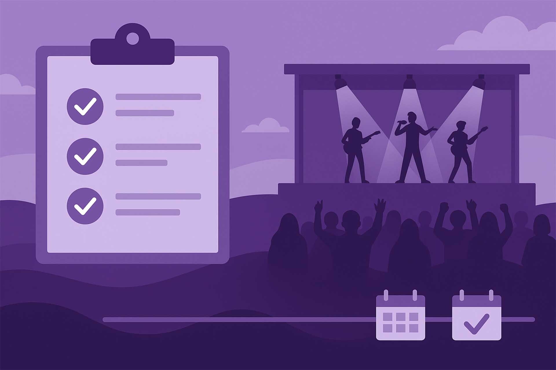
Below is a four-metric scorecard that plays well with most formats. Keep it tight. Keep it honest. And yes, you can still celebrate the sellout. Just don’t stop there.

1. Sell-Through Rate
What it tells you: Demand and pricing fit. If you priced well and promoted smart, this number sings.
Formula
Sell-through rate (%) = Tickets sold ÷ Total tickets available × 100
Example
750 tickets sold out of 1,000 available means 75 percent sell-through. Strong pull, but you left 250 seats lonely. That’s a marketing or price ladder moment.
How to use it
- Track the curve, not just the final percentage. Did sales spike on artist announce, a price bump, a collab post, a weekday email at 8 a.m.? That timing matters.
- If early sales lag, test something finite. A 48-hour buddy bundle, a small early-bird extension, or a creator partnership with a unique code. Small levers, quick reads.
Data you need: Live ticket counts and capacity. Most platforms, including Purplepass, show this in real time so you’re not guessing.
2. Cost Per Attendee
What it tells you: If you’re making money or just making noise. It’s the fastest gut-check for budget sanity.
Formula
Cost per attendee = Total event cost ÷ Total attendees
Example
Total cost was $15,000 dollars. Attendance of 750. Cost per attendee is $20 dollars. If your average ticket is $60 dollars, your margin has room to breathe. If the ticket is $22 dollars, you’re breathing into a paper bag.
How to use it
- Build a pre-event cost model, then update actuals during settlement. Watch categories that creep. Labor, rentals, last-minute AV, that extra security post you swear you won’t need and always do.
- Pair this metric with sell-through to see if a higher price tier is justified or if you need a smaller room next time.
Data you need: A simple budget sheet with quotes, deposits, and finals. Attendance from your scanner or check-in report, not just tickets sold. People ghost. Your spreadsheet shouldn’t.
3. Conversion Rate
What it tells you: Whether your event page and promo actually convince people to buy. Views are cute; conversions pay invoices.
Formula
Conversion rate (%) = Orders or registrations ÷ Unique page visitors × 100
Example
2,150 unique visitors. 750 orders. That’s 34.9 percent. Nice! If you were sitting at 8 percent, something’s off. Usually the messaging, the price tiers, or an extra click that shouldn’t exist.
How to use it
- Make checkout short and ruthless. Every extra step trims buyers. If you can embed checkout on your site, do it.
- Keep the headline, price, and date visible without scrolling. People skim. Respect the skim.
- Match the ad promise to the landing page. If your ad sells “sunset rooftop disco,” do not open with a biography of the sound engineer. Save that for the fans who already bought.
Data you need: Unique page visitors from analytics. Orders from your ticketing dashboard. If you run ads, add UTM tags so you can see which channels convert, not just which ones deliver clicks. If you like a sprinkle of AI, you can toss the export into a spreadsheet model for quick what-ifs. That’s a sidekick move, not a platform feature.
4. Return Intent
What it tells you: If your crowd wants seconds. It’s the soul of recurring events and a sneaky superpower for sponsorships.
How to track it
- Ask a single question within 24 hours. “Would you attend this again?” Yes or No.
- Return intent rate (%) = Yes responses ÷ Total responses × 100
- Add one more question if you can stomach it. “What would make it better?” Keep it optional and short.
Example
420 total responses. 315 Yes. Return intent 75 percent. That’s momentum you can grow. At 38 percent, you need to check friction points. Lines, sound, food, vibe, crowd flow. People are polite in person and very honest in surveys.
How to use it
- Set lightweight survey touch points. A QR by the bar. A link in the thank-you email. A push on your event app if you use one.
- If your event is capacity-limited, segment the Yes group for first dibs next time. The best marketing is earned loyalty plus early access.
- Sponsors love this number. “Seventy-five percent said they’ll be back” speaks louder than a mood board.
When Should You Check These?
Before tickets launch: sanity-check your cost per attendee at forecast levels and build a price ladder that doesn’t need heroics. Bake in your margin on day one rather than praying for a last-minute surge.
During the on-sale: watch sell-through and conversion daily. The cadence tells you when to nudge price tiers, when to release holds, and when to push a small promo without cheapening the brand.
On show day: count actual check-ins so your attendance number is real. This does two things. It fixes your cost-per-attendee math and it tells you how strong your show rate is compared with sales. If you run sessions or classes where late arrivals wreck the flow, peek at arrival patterns every 15 minutes. Smooth lines equal happy people.
Within 24–48 hours after: send the micro-survey for return intent. Keep it friendly, one minute, and mobile-first. You know what? Toss in a tiny thank-you perk for responders. Humans like tiny perks.
Over the next cycle: compare events side by side. Which channel produced the highest conversion. Which price tier drove the healthiest margin. Which venues lifted return intent. Copy what worked. Retire what didn’t.
A Few Lightning Tips that Save Headaches
- Shorten the path to pay. If your checkout takes visitors to a separate universe, you’re leaking conversions. Keep it embedded when you can.
- Name your tiers clearly. If people can’t tell the difference between GA, Early, and Priority, they stall. Stalling kills conversion.
- Watch the first 72 hours. Early velocity predicts the whole campaign. If it’s slow, change one thing at a time so you know what moved the needle.
- Instrument your links. UTMs or nothing. Guessing is expensive.
- Protect the vibe. Long lines sabotage return intent no matter how great the headliner is. Spread arrivals, staff the choke points, and keep the bar moving.
What This Looks Like In Practice
Put these four on a single-page dashboard. No noise, just signal.
- Sell-through rate with a simple day-by-day curve
- Cost per attendee with forecast vs actual
- Conversion rate by channel
- Return intent with the most common “make it better” note
If you’re using Purplepass, you’ll get live sales and check-in data plus exportable reports you can feed into your own sheets or BI tool. If you’re not, use whatever stack you love. The scorecard still works.
Bottom Line: A Sellout is The Loud Headline. The Four Metrics Above Are The Plot.
Track them, learn from them, and your next event won’t just sell. It’ll scale its impact, keep its margins, and build a crowd that keeps coming back.
You wanted simple, not simplistic. Here it is:
- Sell-through shows demand
- Cost per attendee keeps the math honest
- Conversion rate proves the page and promo are doing their job
- Return intent tells you if the story continues
Run that playbook, and your recap won’t be guesswork. It’ll be a blueprint.
/person%20at%20food%20festival.jpg)

-Oct-07-2024-07-36-49-0430-PM.jpg)
-Oct-07-2024-06-26-38-4722-PM.jpg)


/Minimalist%20purple%20illustration%20featuring%20a%20circular%20countdown%20timer%20above%20an%20enthusiastic%20crowd%20silhouette%2c%20symbolizing%20.jpg)